Colour trends in 2021 and their use in office interiors

Colour is one of the fundamental and key tools of interior designers. But it is not a rigid tool that remains the same in every situation.
On the contrary. The use of colour is constantly evolving, led by new discoveries in the field of psychology.
Companies that want to provide employees with an environment that inspires creativity and productivity must not underestimate the colour scheme of the interior. In addition to psychologists and architects, major design companies also deal with colour. Every year, they set trends that affect fashion, the appearance of various products and, of course, interior design. Let's see what colours experts say await us in 2021 and how we can apply them in the office.
This year's colours
Pantone colour of the year 2021:
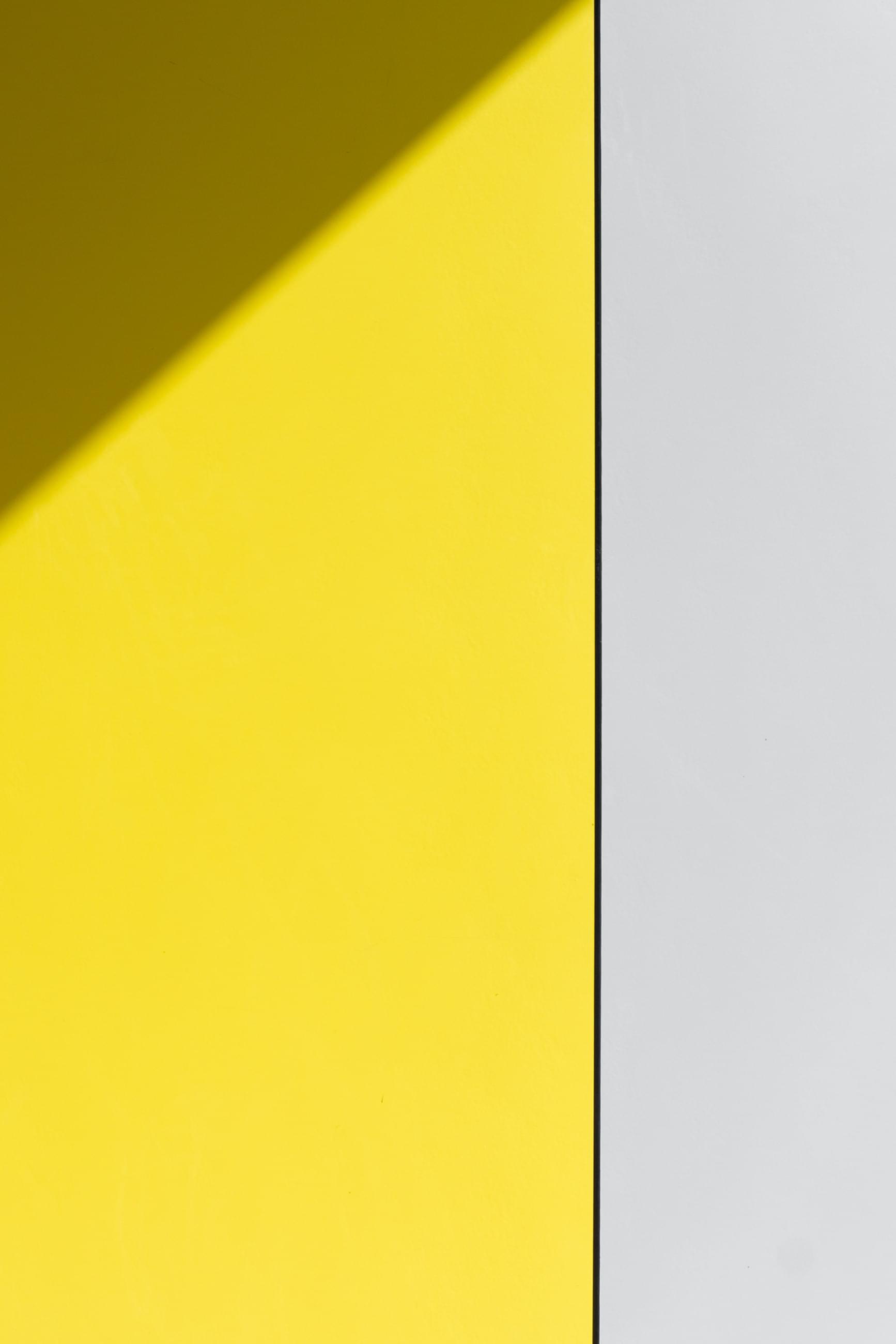
Ultimate Grey and Illuminating Yellow
The Pantone Colour Institute in America is the world's most recognized authority on colour and has announced a major colour trend each year for the past 20 years. According to experts from Pantone, this year we will see a combination of a neutral grey and a strong shade of bright yellow. From a psychological point of view, the combination of grey and yellow supports perseverance together with hope – the qualities that we all need in today's difficult situation.
Dulux colour of the year 2021:
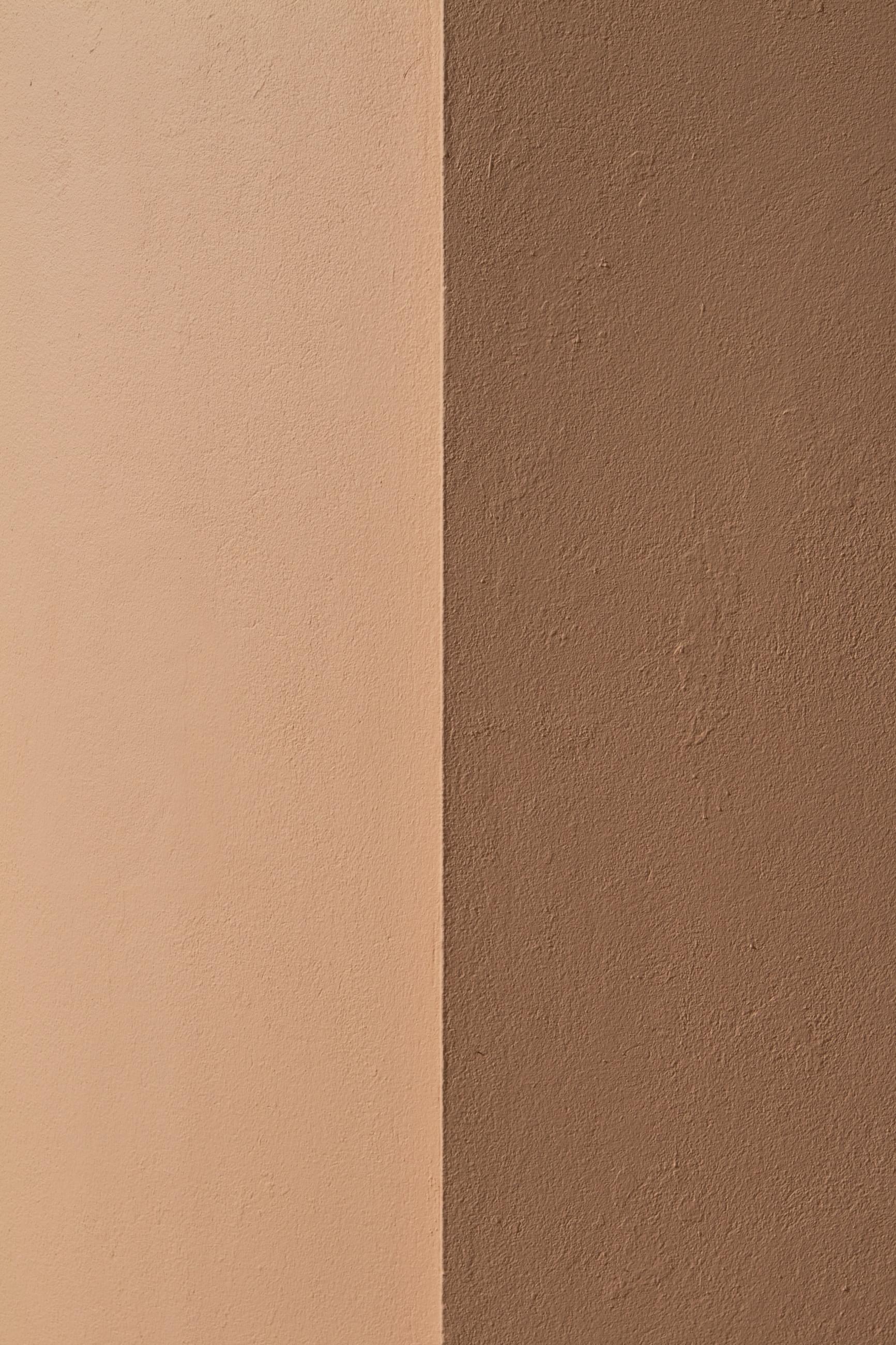
Brave Ground
The world's leading paint manufacturer, Dulux, is also involved in the annual conversation about the ideal colour. For 2021, a team of experts chose the brown shade Brave Ground, a warm and natural neutral colour. The choice of colour was again largely influenced by feelings associated with the coronavirus pandemic. Brave Ground promotes stability and is a shade that can be combined with many other colours.
Jotun Lady colour of the year 2021:
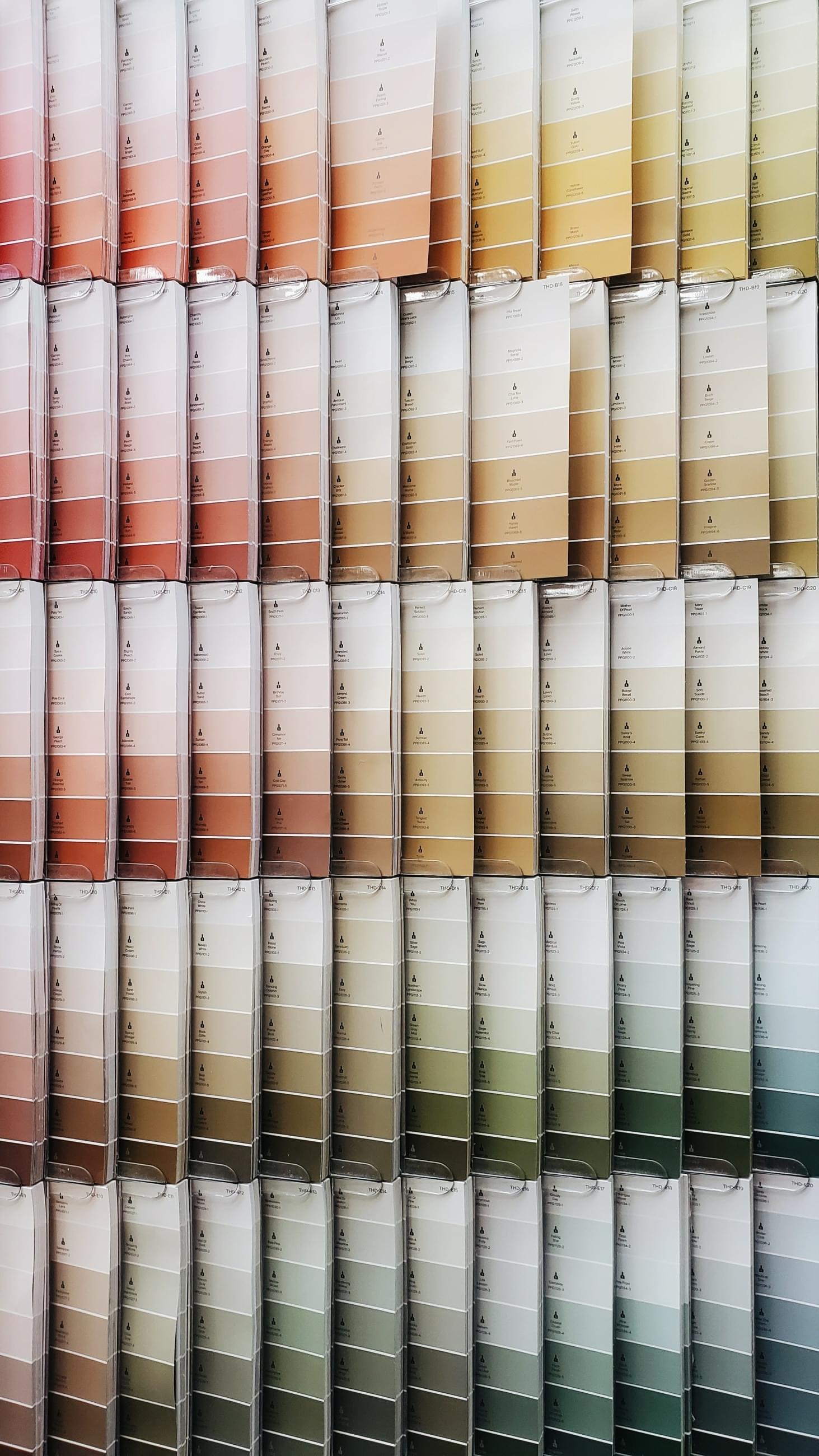
Rediscover Collection
Another paint manufacturer, Jotun, offers not just one or two main colours of the year, but an entire collection called Rediscover. It is full of earthy, natural and neutral colours, which again support the feeling of stability in the interior and can be combined with a wide range of more vibrant colours.
Wondering how important a role the colours of the year play and whether they are appropriate for your space? Architect Michaela Zámečníková from the CAPEXUS team says that the choice should definitely not be just about trends:

We design interiors that will look good on their own for many years. The current trendy color can go out of fashion and may not be suitable for every client.
Incorporating colours into the office space
The choice of colours must begin with a thorough acquaintance with the corporate culture, brand identity and client requirements. Corporate culture can dictate certain desired colour combinations. To find complementary colours, a so-called colour wheel is used, which indicates which combination will be most suitable.
Architect Lucie Kecová says about the process of choosing colours:

It very much depends on the client's requirements and ideas. If desired, the interior can be decorated in corporate colours. It also depends on the style in which the interior is to be designed, then the colour is adapted to that.
Kecová also points out that the corporate colours do not really have to dictate how the offices will be painted. Lucie's words are complemented by Michaela Zámečníková:
Today, using the company's brand colours in the office is no longer commonplace. For example, the client may have a green logo, but we do not have to copy the green into the interior.
It depends on the color
Agile workplaces where flexibility is prioritized need strong, vibrant colours to kick-start employee creativity. Places designed for long-term concentration will appreciate more muted colours. However, the selection of a certain colour alone is not enough to create the desired atmosphere in the space. It is also necessary to think carefully about the lighting and layout of other elements in the interior.
It is important to harmonize the individual elements
Colour combinations can completely change how we perceive a space. It is therefore necessary to pay close attention to how the individual elements (including, for example, furniture) match each other. In addition to the aesthetic point of view, the practicality of the colour combination is also important, especially when it comes to markings on the walls. There, it is necessary to choose highly contrasting pairs of colours that will help people, especially those with visual problems, easily orient themselves in the space.
How colours affect our psychology
The influence of colours on our psyche is of more and more interest to experts, and new research is constantly emerging that confirms the different effects of parts of the colour spectrum on our mental well-being. If we were to focus on all the colours available, we would have to write a book. Zámečníková recommends using a maximum of one strong colour, although again it depends on the type of client. Let's look at the effect that primary and secondary colours have:
Blue
Orange
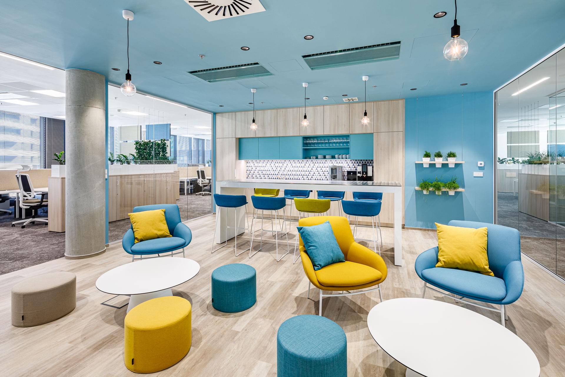
Blue is a soothing colour suitable for relaxation areas, but also, for example, for open space offices, where it helps reduce employee stress. Proof of blue's effectiveness can be seen in the offices of Elektrotrans.
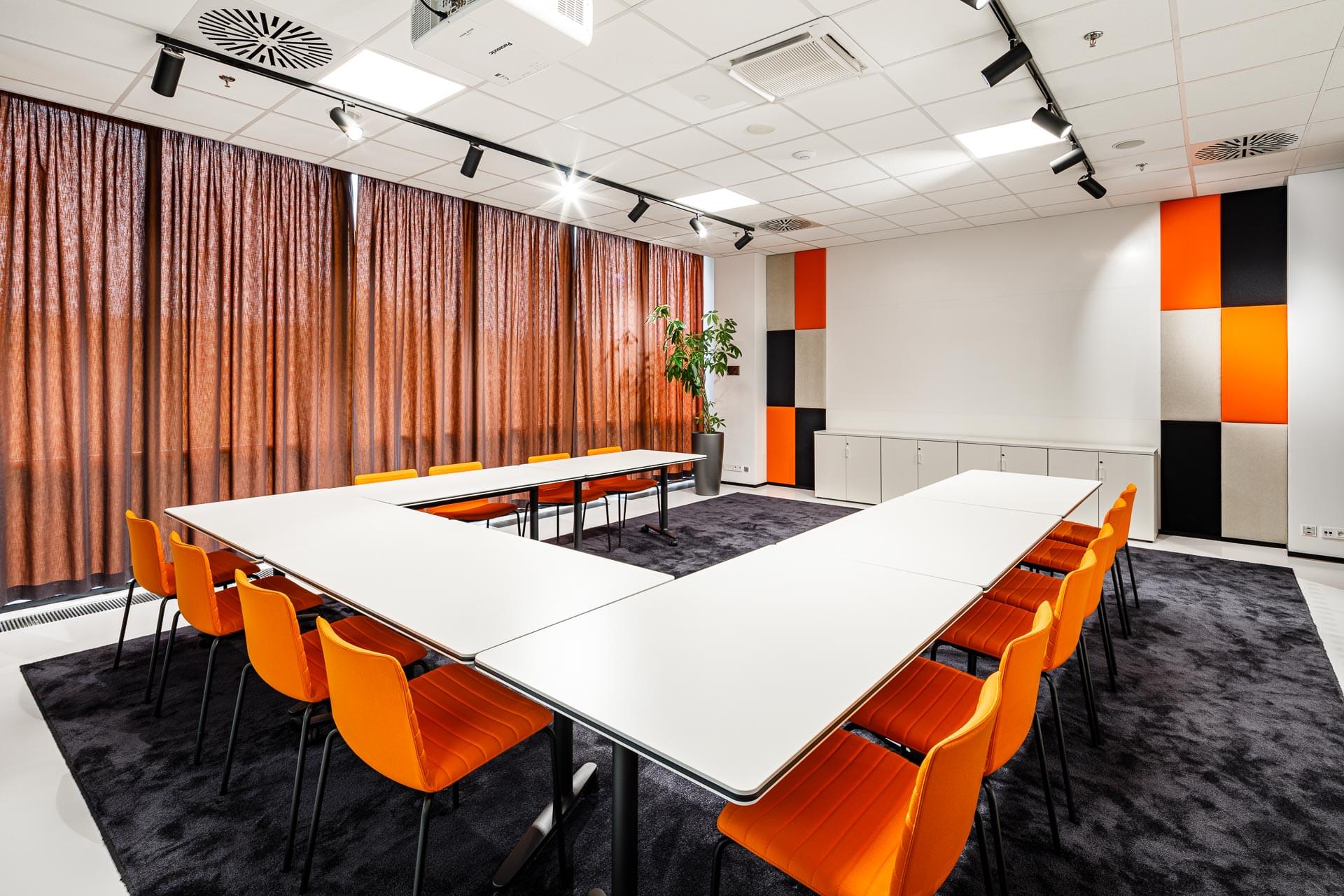
A burst of energy that you will appreciate where you want dynamism. Don't be afraid to use orange in a dining room, kitchen or meeting room, like at Porsche.
Yellow
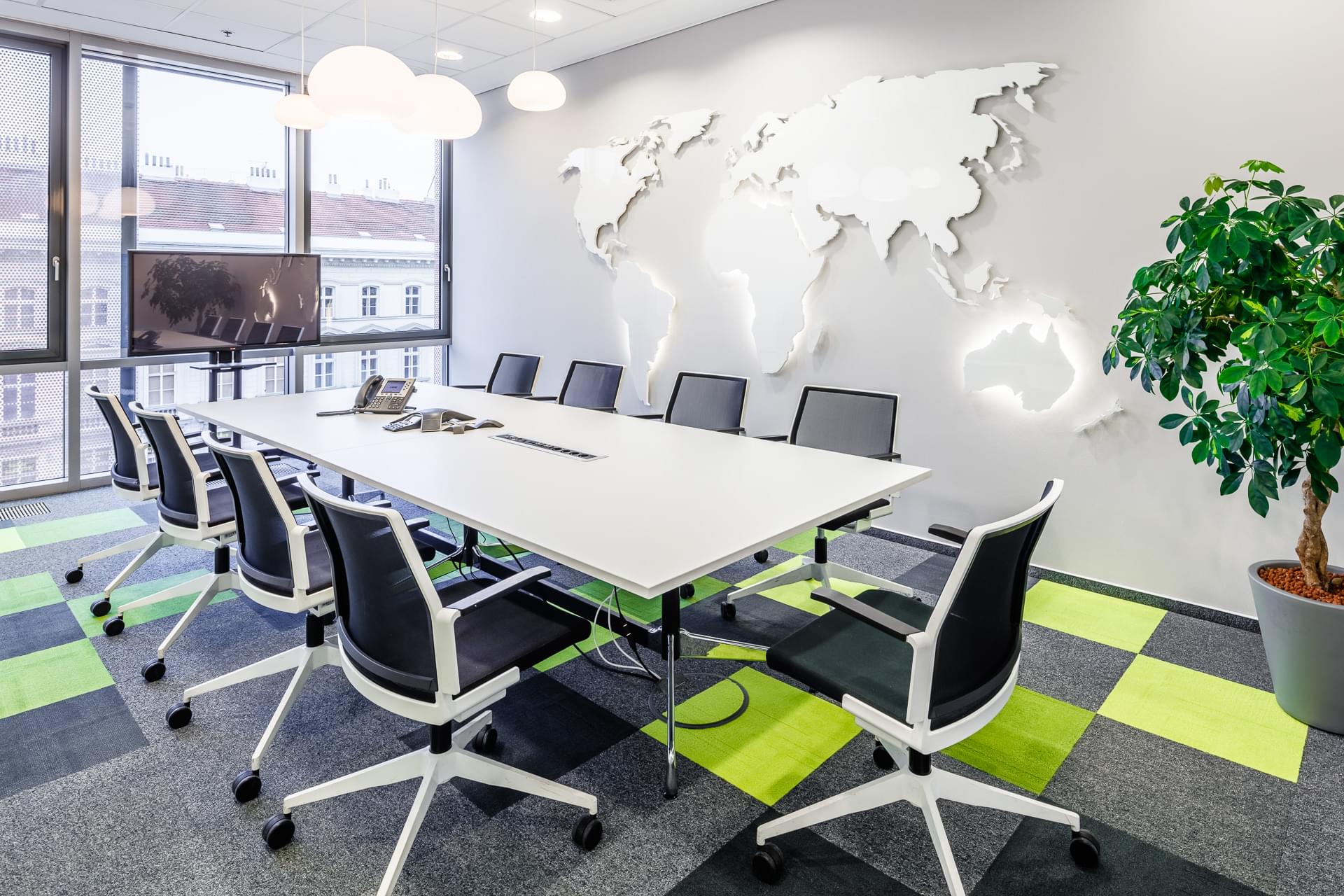
Green
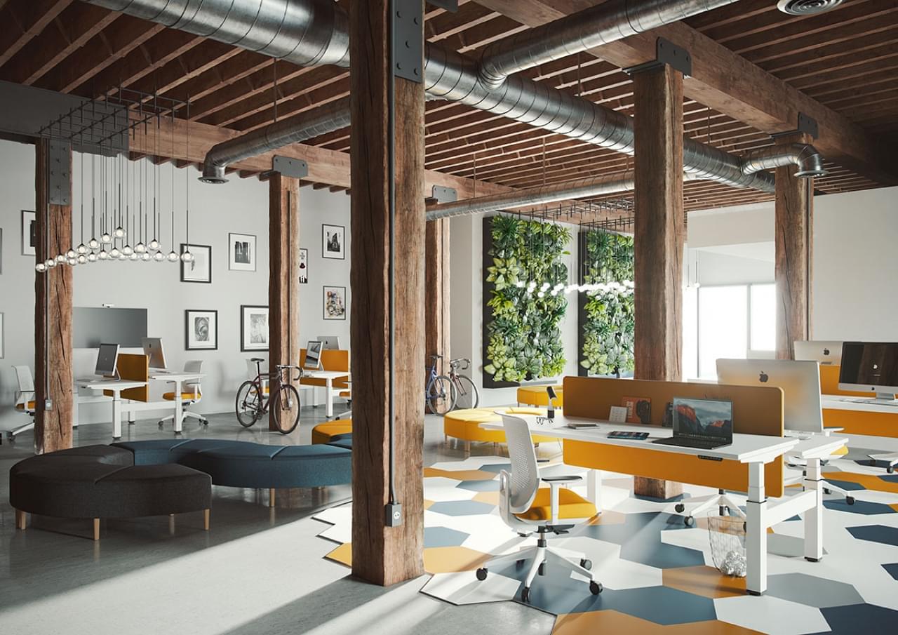
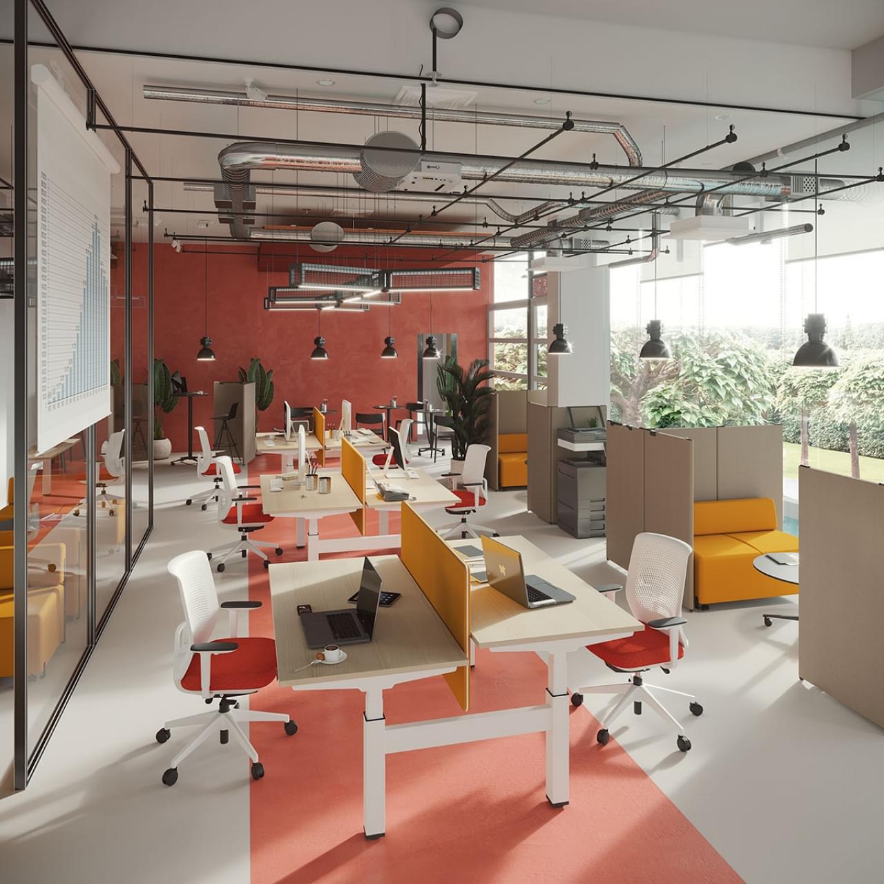
The colour of optimism and curiosity. Yellow can be found especially in spaces where it is necessary to support creativity and cooperation among colleagues. This is evident in the offices of MSC Czech Republic.
Green is the colour of nature and connects us with the outdoors, even when we are in a building with no windows. It can reduce fatigue and reinforce a feeling of stability. Just like in the case of CBRE Global Investors.
Red
Purple
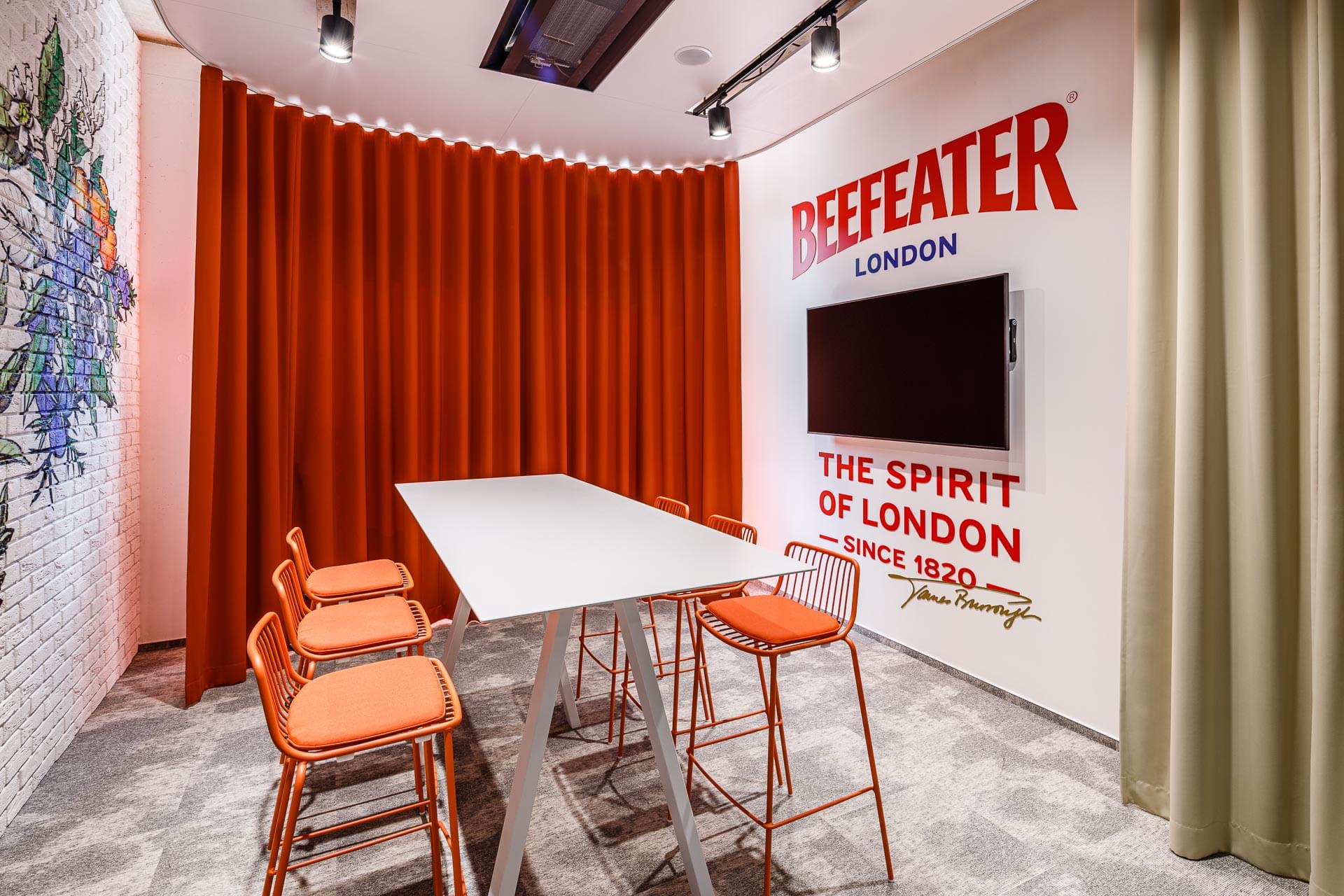
An intense and passionate colour choice. Applied cleverly, it can increase productivity when you need to grit your teeth and find
a solution quickly. It has found application in the implementation
of offices for Regus. It also looks great in the meeting room of Becherovka, which is inspired by Beefeater.
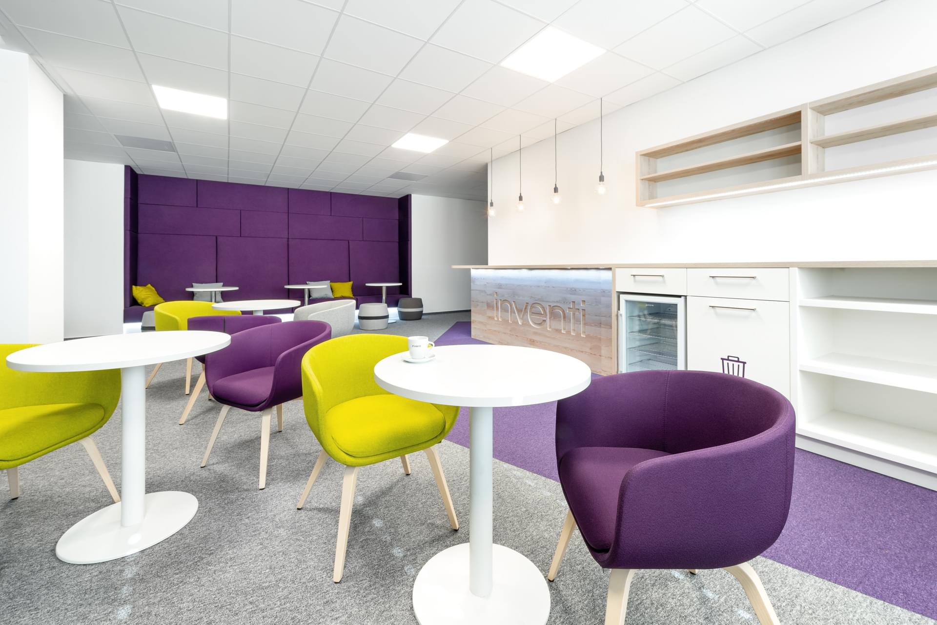
A highly creative and at the same time soothing colour (depending on the ratio of red to blue). Purple is also often associated with aristocracy and therefore serves as a symbol of power. In the offices of Inventi you can't miss it.
We will be happy to help you choose suitable colours. And not only that. A team of more than 100 specialists will take care of your project from A to Z.
Photo authors: Unsplash, Petr Andrlík, FR/VR, Alexander Dobrovodský
Published March 30, 2021